
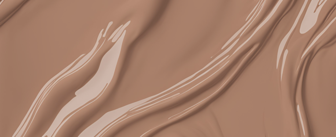
Pantone has spoken, and the 2025 Color of the Year is here: Mocha Mousse
Inspired by this rich, warm hue, I’ve curated 5 stunning color palettes that will help you design a space that’s stylish and timeless. From beachy tranquility to lush jungle vibes, these palettes are not only on-trend but also budget-friendly, with easy-to-use hex codes and design tips to make your dream space a reality. Ready to update your home with 2025’s hottest colors? Let’s dive into these color schemes!
Are you here for hex codes? They’ve been converted to plain text for easy copy and pasting! P.S. All my color schemes are print-friendly!
Affiliate statement: All products on Style My Money are independently selected. Some of the links on this site are affiliate links. This means that if you click on them and make a purchase, I may receive a commission at no additional cost to you. These commissions play a vital role in helping me grow my business and support my family. I truly appreciate your support and trust in my recommendations. It allows me to continue providing valuable content and resources for you. Thank you for being a part of this journey with me!
Five Genius Color Schemes
What makes them genius? While carefully crafting each scheme, I focused on these core attributes:
Versatility: While each has a clear personality, the colors are approachable enough to work in lots of context!
Uniqueness: So many Mocha Mousse schemes connect the color to wood tones and coffee. Great, but, more please? I scoured my inspiration folders for images that used the color in novel ways. Not easy for me, but I think you’ll agree the end product is worth it!
Ease of Use: All of these colors are print friendly! No need to compromise if you are using them for a graphic design or hoping to print crisp swatches that your hardware store can turn into custom paint colors! (Remember that screen calibration can make your printed result appear different from the digital version.)
Harmony: I’ve applied years of color theory knowledge to pick shades that feel good together. Trust me, there’s a lot more to this than just grabbing random swatches from a photo! Like I said before, though, I hope you’ll agree the finished color schemes are worth the effort.
Now, without further ado, the schemes…
1. Brilliant Beach
Brilliant Beach evokes the serene beauty of a coastal getaway, with a combination of soft blues, sandy neutrals, and refreshing aqua tones. It’s the perfect color scheme for creating a light, airy, and relaxed atmosphere—ideal for living rooms, bathrooms, and bedrooms where calmness and peace are a priority.

Perfect for…
Coastal Interiors: This scheme fits perfectly into the coastal or beach-inspired design trend, bringing the tranquility of the shore to your home.
Biophilic Design: Inspired by nature and natural textures, this scheme connects your indoor space with the outdoors.
Get the Hex Codes
Javascript users: Simply click the button for the hex code you want–it will copy automatically!
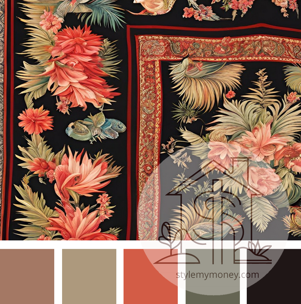
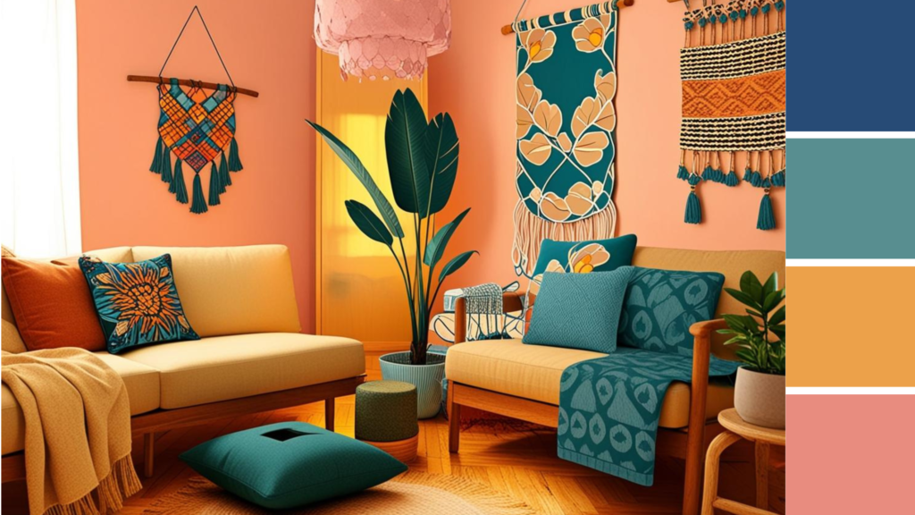
2. Tropical Tapestry
Inspired by lush jungles and vibrant flora, Tropical Tapestry shines with calm greens and bright florals that take full advantage of Mocha Mousse’s natural warmth. This scheme creates an energetic and lush vibe, making it perfect for spaces that need a lively, vibrant atmosphere—think living rooms, kitchens, or even home offices that crave a little extra flair.
Perfect for…
Tropical Modernism: With its bold, nature-inspired elements, this color palette fits into the tropical modernism movement, bringing a fresh and vibrant flair to any space.
Eclectic Interiors: The rich, diverse mix of colors aligns with the eclectic trend, where mismatched pieces and bold hues take center stage.
Grandmillenial: This color scheme works well with the big, bright florals that dominated in the 1990s.
Get the Hex Codes
Javascript users: Simply click the button for the hex code you want–it will copy automatically!
3. Serene Study
Serene Study blends soft, muted tones of gray, light taupe, and gentle blues to create a peaceful, quiet space for concentration and relaxation. Don’t let my nickname fool you, it’s perfect for more than just study areas! Your family room, bedroom or lounge will benefit from this color scheme, which promotes focus and mindfulness, while still offering warmth and comfort.
Perfect for…
Minimalist Interiors: This soothing color palette fits seamlessly into minimalist design trends, focusing on simplicity and calmness.
Zen Interiors: With its calming hues, this palette works well for creating a zen-inspired space that promotes relaxation and mental clarity without settling for the dull tones that have become a trend cliche.
Dark Academia: You’ll pore over your antique manuscripts in peace and style with these colors all around. Plus, that honey hue will help you keep the classic, bookish vibe without getting too dark.
Get the Hex Codes
Javascript users: Simply click the button for the hex code you want–it will copy automatically!
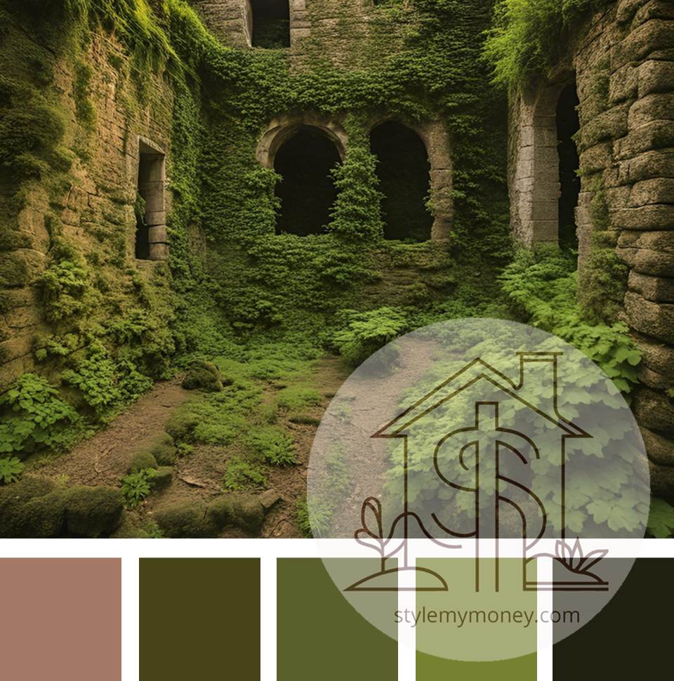
4. Mystic Moss
Mystic Moss pulls inspiration from the deep, mossy green hues found in overgrown jungle ruins. A stunning balance of rich green tones and earthy neutrals, this scheme creates a mysterious, nature-driven atmosphere. Perfect for statement walls, cozy bedrooms, or living spaces that want to feel grounded and connected to nature.
Perfect for…
Jungalow Style: This is perfect for the Jungalow trend, a fusion of bohemian and nature-inspired styles, bringing greenery and earthy elements indoors.
Mid-Century Modern Revival: The rich, deep tones of Mystic Moss also complement the mid-century modern revival trend, where earthy shades bring a touch of retro charm to contemporary design.
Get the Hex Codes
Javascript users: Simply click the button for the hex code you want–it will copy automatically!
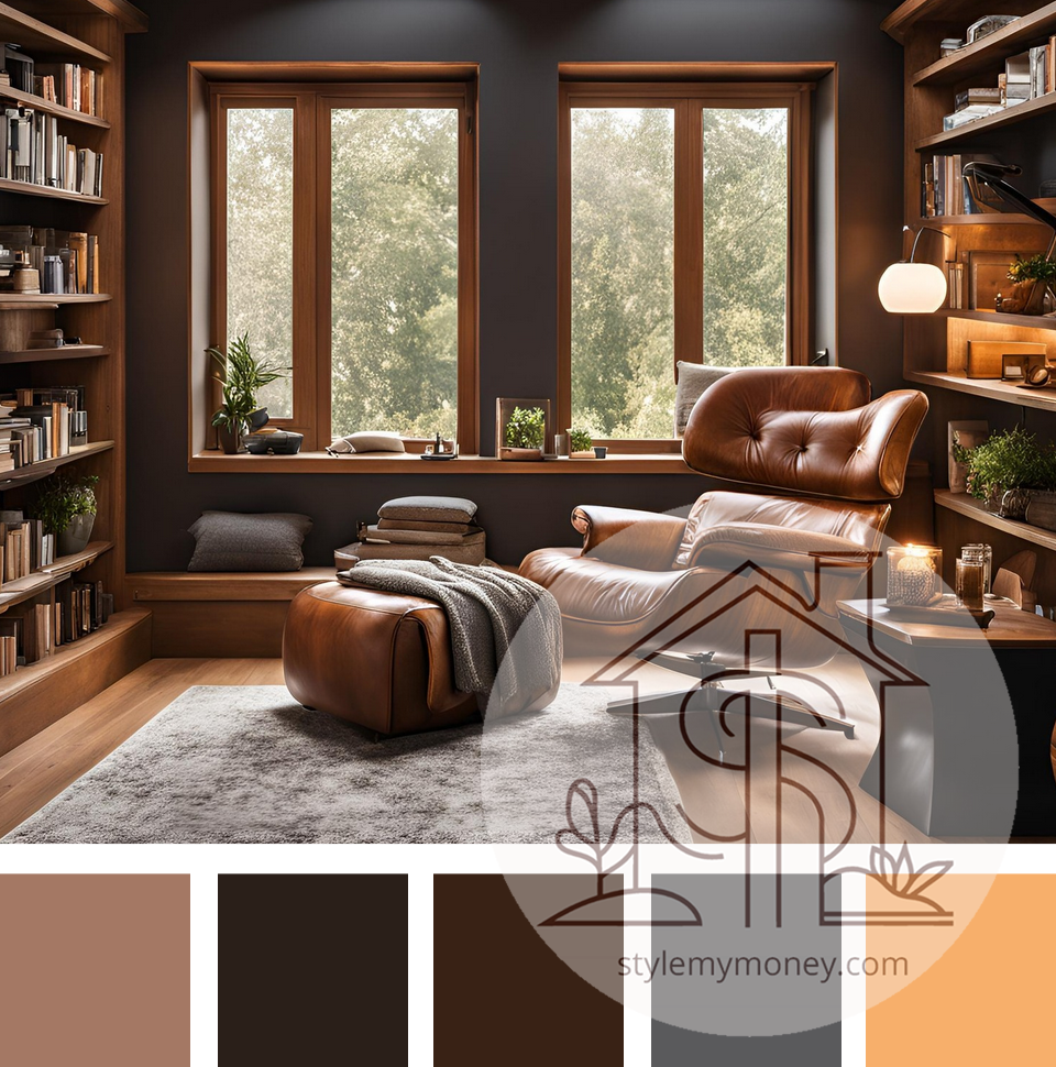
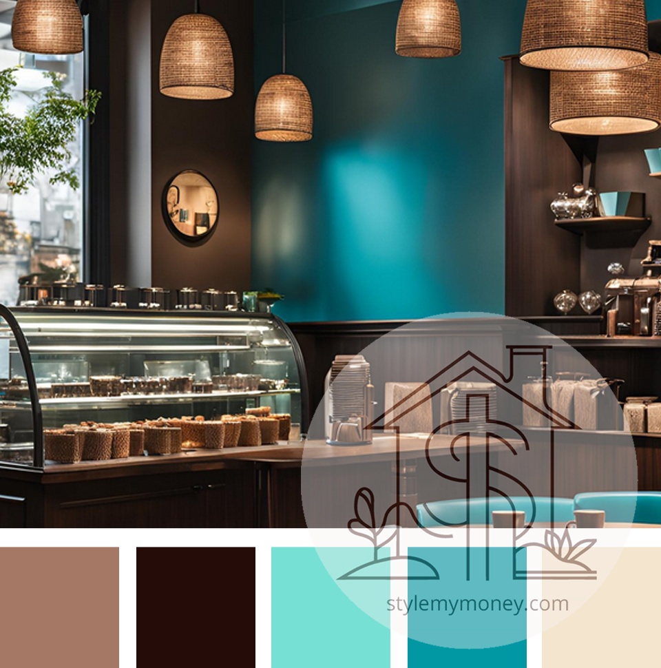
5. Chocolate Chill
Chocolate Chill is inspired by the cozy comfort of sipping on a glass of chocolate milk. A soothing blend of warm browns and cool blues, this color palette creates an inviting and relaxed space. It’s ideal for creating cozy living rooms, home offices, or even dining areas where you want to unwind and feel at ease.
Perfect for…
Warm Minimalism: The balance between cozy browns and calming blues makes this palette fit the warm minimalism trend, where neutral tones are used to create calm, curated spaces.
Modern Farmhouse: Chocolate Chill complements the modern farmhouse aesthetic, combining rustic charm with sleek, contemporary touches.
Boho Chic: I didn’t even think of this one until I spotted this gorgeous wallpaper mural. These shades are very similar to Bengali blue, a shade you can find in certain oriental rugs and their budget-friendly imitations.
Get the Hex Codes
Javascript users: Simply click the button for the hex code you want–it will copy automatically!
Conclusion
Each of these color schemes brings its own unique charm, from serene beach vibes to mysterious jungle overtones. Whether you’re updating a living room, designing a home office, or completely transforming your space, these palettes offer endless possibilities for creating a stunning, budget-friendly interior. Need more help using these? Check out my guide to the 60-30-10 Color Rule. More resources coming soon!
Happy designing!


Leave a Reply