
What is the 60-30-10 Color Rule?
The 60-30-10 color rule is a timeless guideline that many interior decorators and enthusiasts use to create balanced and visually appealing spaces. Essentially, it’s about using three colors in your design: 60% of a dominant color, 30% of a secondary color, and 10% of an accent color. This simple structure helps ensure that your room feels cohesive yet vibrant.
Applying the 60-30-10 Color Rule in Your Space
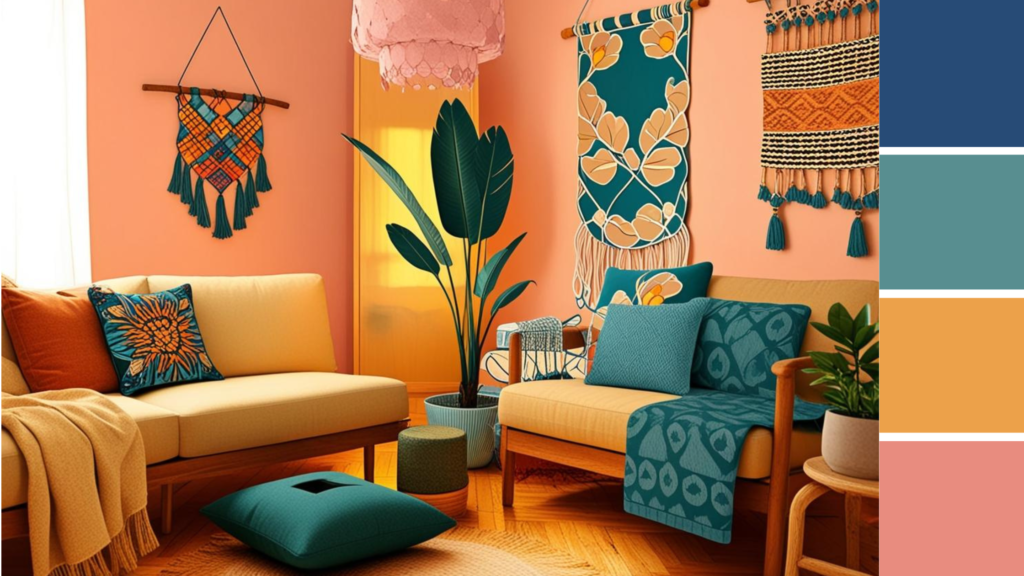
When you’re working with the 60-30-10 rule, the first step is to choose your dominant color. This is typically the color of your walls, as it takes up the most visual space. Next, you’ll select a secondary color to complement the dominant shade—think about your furniture or the fabric of your curtains for this. Finally, the accent color, which can be from accessories like throw pillows or art pieces, adds that pop of personality to your room.
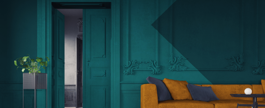
Most people choose a neutral for their dominant color, then get progressively more daring with their accent color. That’s a great place to start, but remember: the beauty of this rule is that it works with basically any three colors! Like the header image above, you can easily create daring designs by using a bold dominant color.
Help! My furniture has more than three colors!
Not everyone has a perfect matching furniture set, but that shouldn’t deter your decorating ambitions! Here are four tips to help you stick to the 60-30-10 rule even with mismatched pieces:
-
Find a Common Element: Look for colors within your mismatched furniture that can tie them together. Perhaps your chairs have a similar shade to your area rug, or maybe they share a common texture.
-
Use Accent Colors Wisely: If your furniture doesn’t match perfectly, let your accent color do the heavy lifting. Choose throw pillows or artwork that includes colors from both pieces to create harmony.
-
Go with Neutrals: If your dominant color is neutral, it can balance out mismatched furniture effortlessly. This allows you to add various colors through your secondary and accent choices without overwhelming the space.
-
Don’t Stress About Perfect Matches: Most of us want a space that looks personal and homey, and matchy-matchy isn’t it! An aubergine couch, a maroon lamp and a periwinkle throw all read as “purple” and will coordinate just fine.

See what I mean? Multiple shades of purple coordinate beautifully despite being different hues. A quality multicolored rug also can bring your space together by combining different colors from your furniture! Image by Max Vakhtbovcyn.


Leave a Reply