

Looking to give your living room a refresh this year? Say goodbye to boring neutrals and hello to bold, vibrant hues that’ll bring energy and personality into your space! 🌈✨ Whether you’re into rustic charm, sleek modern vibes, or eclectic fun, 2025 is the perfect time to try a color combo that makes your living room pop. Ready to make a statement? Let’s dive into these five exciting color schemes that will totally transform your space!
Affiliate statement: All products on Style My Money are independently selected. Some of the links on this site are affiliate links. This means that if you click on them and make a purchase, I may receive a commission at no additional cost to you. These commissions play a vital role in helping me grow my business and support my family. I truly appreciate your support and trust in my recommendations. It allows me to continue providing valuable content and resources for you. Thank you for being a part of this journey with me!
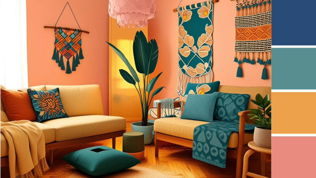
1. Orange Smile 🍊

🔮 Dominant Color: Seafoam
🧡 Secondary Color: Juicy Orange
🤎 Accent Color: Caramel
Perfect for:
- Eclectic boho living rooms 🌿
- Mid-century modern spaces 🏡
- Rooms that need a little sunshine (literally and figuratively!) 🌞
- Anyone who wants a playful yet calming vibe
How to use it:
Kick things off with the cool and calming vibes of Seafoam on your walls to create a laid-back backdrop. Then, bring the fun with Juicy Orange! Add it through cushions, throws, or even an accent chair to really make your space pop. A dash of Caramel in your furniture or accessories will warm up the look and keep everything feeling cozy. Think of this as a perfect combo for a room that’s both relaxing and fun—just like a sunny day at the beach. 🌊
Product Recommendations

This stylish orange chair by Artechworks has great reviews. The tufted design and fantastic, mid-century detailing mean that, despite the bold color, it’s likely to fit in well with almost any modern decor. As a bonus, they also sell a matching loveseat that might be even cooler than the chair!

For another take on classic-yet-modern, I’m really intrigued by this chair by Vingli! The classic design has the versatility to give it a place in your room for years to come. The reviews say it’s incredibly comfortable, which is a must in my book for any living room chair.
Suggested Paint Colors:
Getting the perfect wall color takes more than just a photo or a hex codes. Your home’s unique lighting and furnishings can make colors appear drastically different from what appears on your screen or on the paint can’s label. For this reason, it’s so important to apply test swatches to your wall to make sure you have the color you want. My preferred method of doing this is buying 100% real paint sample stickers from Samplize. Instead of dealing with tiny cans of paint, all their samples are peel and stick! And yes, they have no-damage adhesive, which means that they easily peel off when you’re done testing and ready to commit!
If you want to give my recommended colors a try, simply click the name or image to go directly to the product page for Samplize.
Dominant


Secondary


Accent


Hex Codes
Simply click the button to copy the hex code!
2. Cozy Tetra 🧸

🔮 Dominant Color: Evening Blue
🌞 Secondary Color: Sunshine Yellow
🍠 Accent Color: Sweet Potato
Perfect for:
- Coastal vibes with a modern twist 🏖️
- Traditional rooms with a bold edge 🏠
- Spaces that crave comfort with a burst of color 🧣
- Anyone who loves their rooms cozy yet energetic
How to use it:
Start with the deep, calming tones of Evening Blue for your walls or larger furniture pieces to give your room a grounded, serene feel. Then, throw in some Sunshine Yellow for those accent pieces—think bright pillows, quirky art, or a cheerful rug. Sweet Potato adds a warm, earthy feel and works wonders in fabrics like curtains or even a colorful ottoman. It’s the perfect combination for a space that’s as welcoming as it is stylish—like a warm hug with a splash of sunshine. 🌻

These abstract vintage pillow covers come in a set of four, allowing you to sprinkle them around the room for an instantly put-together vibe. This is a great way to dip your toe into bold colors–not only are they a great deal and well-reviewed, but they’re super easy to swap out if your tastes change.

I am a huge fan of using rugs to instantly transform a space. I own a couple rugs by this company and this gorgeous jute rug in rust red will definitely feel amazing underfoot while tying together your bold color scheme.
Suggested Paint Colors:
Getting the perfect wall color takes more than just a photo or a hex codes. Your home’s unique lighting and furnishings can make colors appear drastically different from what appears on your screen or on the paint can’s label. For this reason, it’s so important to apply test swatches to your wall to make sure you have the color you want. My preferred method of doing this is buying 100% real paint sample stickers from Samplize. Instead of dealing with tiny cans of paint, all their samples are peel and stick! And yes, they have no-damage adhesive, which means that they easily peel off when you’re done testing and ready to commit!
If you want to give my recommended colors a try, simply click the name or image to go directly to the product page for Samplize.
Dominant


Secondary


Accent


Hex Codes
Simply click the button to copy the hex code!
3. Bright and Bold

🔮 Dominant Color: Dove Gray
💛 Secondary Color: Canary Diamond
💎 Accent Color: Bright Sapphire
Perfect for:
- Sleek and minimalist living rooms 🖤
- Contemporary spaces that still want a color pop ✨
- Those who love high contrast and bold statements 🖋️
- People who want to keep it chic but with personality!
How to use it:
Dove Gray creates the perfect sophisticated backdrop—light, airy, and perfect for larger spaces or furniture. Add a punch of Canary Diamond on accents like throw pillows, light fixtures, or a bold rug. Then, finish off with Bright Sapphire—whether in art, vases, or a stunning armchair, it’s the perfect way to inject a bit of drama into the room without feeling overwhelming. It’s a perfect combo for those who love chic, modern spaces with a little edge. 💫

Blue velvet couches are the hot item for living rooms in 2025! With couches, I strongly believe you should buy the best model you can afford, but if you are on a tight budget, this striking blue velvet couch is known and loved across the internet.

Speaking of splurges! This beautiful tufted loveseat by Steve Silver is on my wishlist. The designer/seller have an excellent track record for providing amazing furniture that can last a lifetime. Blue really doesn’t go out of style!
Suggested Paint Colors
Getting the perfect wall color takes more than just a photo or a hex codes. Your home’s unique lighting and furnishings can make colors appear drastically different from what appears on your screen or even on the paint can’s label. For this reason, it’s so important to apply test swatches to your wall to make sure you have the color you want. My preferred method of doing this is buying 100% real paint sample stickers from Samplize. Instead of dealing with tiny cans of paint, all their samples are peel and stick! And yes, they have no-damage adhesive, which means that they easily peel off when you’re done testing and ready to commit!
If you want to give my recommended colors a try, simply click the name or image to go directly to the product page for Samplize.
Dominant


Secondary


Accent


Hex Codes
Simply click the button to copy the hex code!
4. Martini Olive 🍸

🔮 Dominant Color: Sweet Sage
🍊 Secondary Color: Sweet Orange
🛠️ Accent Color: Steel
Perfect for:
- Nature-inspired, earthy living rooms 🌱
- Boho and rustic vibes 🏡
- Spaces that need a fresh yet vibrant twist 🌾
- Those who love a mix of calmness and liveliness
How to use it:
Let Sweet Sage work its magic as the calm, nature-inspired dominant color for your walls or furniture—it’s subtle and soothing, just like a gentle breeze. Then, add a fun pop of Sweet Orange with accent pillows, a quirky throw, or even a bright chair. Steel comes in as the grounding element—use it in your furniture, light fixtures, or even a steel coffee table to add some sleek, modern charm. This combo is perfect for a space that feels both laid-back and energetic—like sipping on a refreshing cocktail in the sun! 🌞
Suggested Paint Colors:
Getting the perfect wall color takes more than just a photo or a hex codes. Your home’s unique lighting and furnishings can make colors appear drastically different from what appears on your screen or even on the paint can’s label. For this reason, it’s so important to apply test swatches to your wall to make sure you have the color you want. My preferred method of doing this is buying 100% real paint sample stickers from Samplize. Instead of dealing with tiny cans of paint, all their samples are peel and stick! And yes, they have no-damage adhesive, which means that they easily peel off when you’re done testing and ready to commit!
If you want to give my recommended colors a try, simply click the name or image to go directly to the product page for Samplize.
(If you’ve already read this the first three times it’s appeared on the page, you are awesome! I get so many questions about why paint colors don’t look right that I have to repeat this message for the people who scroll past the first few times…)
Dominant


Secondary
Accent Color


Hex Codes
Simply click the button to copy the hex code!
5. Azure Mood

🔮 Dominant Color: Azure
🏙️ Secondary Color: Concrete
🌿 Accent Color: Verdant Green
Perfect for:
- Contemporary and industrial living rooms 🏢
- Spaces that need a fresh, cool vibe 🌬️
- Bold, statement-making interiors 💬
- Those who crave a room that feels refreshing and modern
How to use it:
Azure takes the spotlight here as the show-stopping dominant color—go big with a striking blue accent wall or a bold sofa. Concrete keeps things grounded with industrial charm; think concrete floors or sleek furniture pieces. Verdant Green adds a touch of nature and calm with indoor plants, green cushions, or artwork. Together, these colors create a space that feels both fresh and bold—a perfect blend of city sophistication and natural calm

Color drench and giant, moody accent walls are huge this year, but if you are nervous about committing, renter-safe peel and stick wallpaper can be a great way to dabble without hardcore commitment! This Yasinet Peel and Stick wallpaper is in that beautiful blue-green/azure shade and the gold accents will go with virtually anything!

A well-placed green accent table can really make a bold, moody palette like this sing! I love these Glitzhome nesting tables. They provide a fun splash of color and storage, to boot!
Suggested Paint Colors:
Dominant


Secondary


Accent


Hex Codes
Simply click the button to copy the hex code!
Conclusion
2025 is all about making bold, fun color choices for your living room! From the zesty vibes of Juicy Orange to the sleek sophistication of Azure, these vibrant color combinations will inject energy and style into any space. Don’t be afraid to play with contrast, texture, and color—this year, it’s all about creating a living room that feels as good as it looks.
Which color scheme is calling your name? Let us know in the comments, and be sure to share your colorful living room updates with us—we can’t wait to see how you use these bold hues! 🎨✨
Need more color insights and advice? We have a ton of posts just like this one with palettes, product recs and more!




Leave a Reply