
Designing a space can be an exciting journey of trial and error, experimentation, and discovery. For me, it all starts with the color scheme — and in this case, a bright, cheery palette featuring teal, peach, and yellow. Let me walk you through how I arrived at this color scheme and how I used it to create a boho living room vision!
Designing the Color Scheme
When I approach a color scheme, I usually begin with a single color that I feel drawn to. In this case, it was teal. Teal is one of those colors that always has a place in decor, though its exact shade can change with the seasons. For this project, I wanted something on the brighter side, leaning more toward blue than green.
Nature is my greatest inspiration for brilliant color schemes — think sunsets or fields of wildflowers!

When searching for teal inspiration, I didn’t find much, so I decided to create my own perfect palette.
I wanted to bring in something bright and cheery, and for me, that usually means working with complementary colors. Since teal is a mix of blue and green, its complementary color is red-orange. But why stop at one complement when you can have more? I decided to go with a split-complementary scheme by adding a pale green with a hint of blue and a pale pink (red) with a hint of orange.

Next, I fine-tuned the hues, saturation, and brightness in Photoshop. I am such a nerd that playing with color sliders is actually super fun for me. Yeah, I have weird hobbies. Anyway! I asked Canva for a butterfly illustration to bring a bit of bold, artsy flair to the scheme. Canva and Coolors have tools that allow you to generate a color scheme based on an image. The colors Canva suggested were close, but I ended up tweaking them a bit to achieve just the right balance. I added a sunny yellow and a moderately saturated dark brown to round out the palette — neutral-ish colors that would give the scheme versatility and a touch of sophistication.
Boom! I had my palette — bright, bold, and ready to pin.

Applying the Color Scheme to an Interior Design
When it comes to applying a color scheme in an interior design setting, I follow the 60-30-10 rule. This means the dominant color will cover 60% of the space, the secondary color will take up 30%, and the accent color will make up about 10%. It’s a quick and easy way to create balance with just three colors.
Since my chosen color schemes has six colors, this did mean that I had to narrow it back down to three.
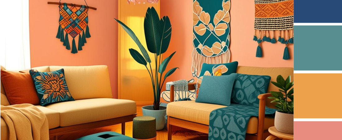
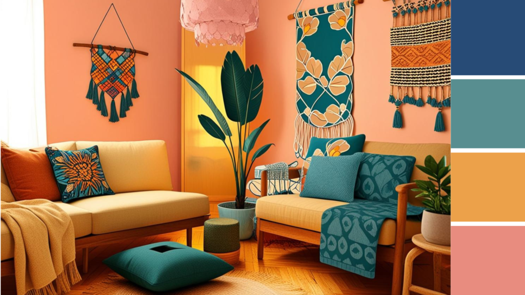
For this room, my goal was to create a bright, cheery boho living room. I love the mix of natural materials with vibrant modern hues, so I went with peach, teal, and yellow. Peach and teal are one of my favorite combinations, and the yellow added an extra burst of energy.
My seed idea for the space was a bright, cheery boho living room. I wanted that mix of natural colors/materials with bright, modern hues. With this in mind, I went with the peach, teal and yellow. Peach and teal are one of my favorite color combos (personal bias ahoy!) and the yellow pushed everything into the bright, cheery space.
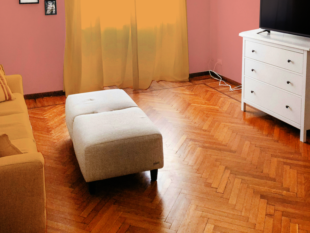
Now to decide what went where. After being raised in a muted world of beige walls, I still have trouble picturing how paint is going to look, so I set out to make a visualizer for myself, basically an interior design coloring page! For this very purpose, I had saved a very nice, clean, white living room image from Unsplash. I knew it would be a good basis for my visualizer because it showed two different walls, the ceiling, a curtain, a light fixture, and just enough furniture to read “living room.”

Choosing the Dominant Color
The next step was to color it in. In photoshop, I created color overlays and then started playing. A solid turquoise accent wall or ceiling made things way too dark. The yellow walls felt too safe. The pink walls felt too… pink? But it was a start. Pink would be my dominant color. I love a painted ceiling, but I decided I liked the airiness of the white, so I kept it.

Choosing the Secondary Color
Next, I needed a secondary color to fill about 30% of the space. This is where yellow came in. Yellow brings light and a sense of calm while still being bold enough to hold its own. I decided to place yellow on the curtains and couch. Any more yellow, and the room would feel cramped and too pastel. But with yellow in those key places, it gave the room a sunny, welcoming vibe.
Working with an Accent Color
That left me with teal, which would be my accent and take up about 10% of the visual space. All I had left to color was the chandelier, the ottoman and the media table.
The light/airy chandelier looked really weird in a dark color, so teal wasn’t going to work. The ottoman and the media table looked good in teal, but the space was looking very uniform in a way that didn’t feel right to me. So, I went back to my color scheme and grabbed my dark blue, which I then added to my media console drawers. The solid color was too heavy, but I tried a pattern that someone might stencil on and found the combination to be so much more interesting and chic!

Adding Pattern and Texture
After settling on the furniture layout, I knew I needed to add some pattern and texture to the walls. I used the butterfly image I’d generated earlier to add a natural touch to the walls, but I still felt like something was missing. The space needed an accent wall that really pulled everything together. I decided to go with a bold floral print to break up the pink walls and incorporate all of the colors in the palette.
I fed my color scheme back into Canva and asked for a bright floral print. I inserted it into my image in Photoshop, skewed it to fit the perspective and — yes! — the floral pattern tied everything together perfectly, adding interest and texture to the room.
With a more cohesive design in mind, I finally settled on a pink chandelier. It’s a fun, feminine and chic touch. After adding in my butterfly image for more visual interest, I finally had a design concept I could work with.

Finalizing the Concept
After refining the walls and the furniture, I was finally happy with my vision. Here’s the plan I settled on:
- Main wall color: Pink
- Accent wall: A patterned floral mural incorporating all the colors
- Main furniture color: Yellow (couch and curtains)
- Accent furniture color: Teal (ottoman and media table with stenciled design)
But of course, I’m never satisfied with just a basic design. I wanted to bring in more boho charm, so I turned to Canva AI once again to generate a more detailed illustration of the space with boho furnishings. While Canva AI’s interior visuals aren’t always perfect, I loved how this one turned out. It gave the space the look of a digital rendering — not too realistic, but perfect for conveying my concept. This is particularly important for Pinterest, since so many users get upset if they feel someone is trying to pass AI off as a real photo of interior design.

Bringing the Vision to Life
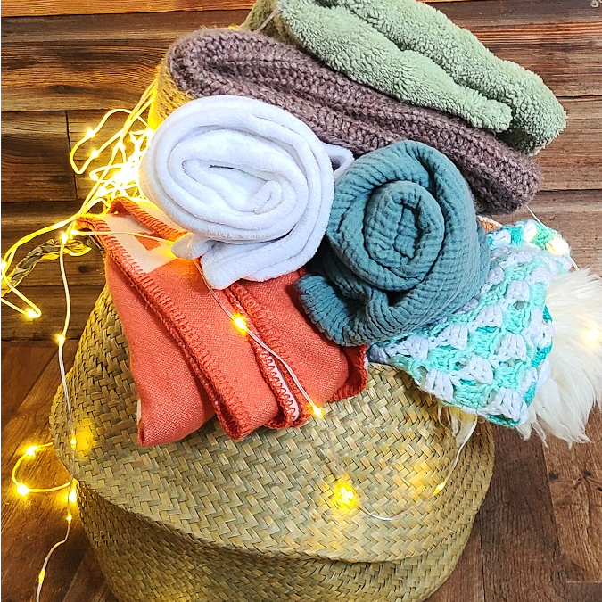
The final step was to round out the room with actual products that fit the boho aesthetic. I did some virtual shopping to find the perfect pieces — soft throws, cozy pillows, textured rugs, and statement lighting — and added them to my design in Canva. I then arranged the pieces until it all felt balanced and cohesive.
“It’s booty-ful!” my son exclaimed. And that was the moment I knew I had a winner.

Using This Concept in Your Living Room
If you’re inspired by this design, I’d love to see how you incorporate these colors and ideas into your own space! Here are a few products I’d recommend to bring this concept to life. Skip to key takeaways.
Affiliate statement: All products on Style My Money are independently selected. Some of the links on this site are affiliate links. This means that if you click on them and make a purchase, I may receive a commission at no additional cost to you. These commissions play a vital role in helping me grow my business and support my family. I truly appreciate your support and trust in my recommendations. It allows me to continue providing valuable content and resources for you. Thank you for being a part of this journey with me!
Suggested Paint Colors
Getting the perfect wall color takes more than just a photo or a hex codes. Your home’s unique lighting and furnishings can make colors appear drastically different from what appears on your screen or on the paint can’s label. For this reason, it’s so important to apply test swatches to your wall to make sure you have the color you want. My preferred method of doing this is buying 100% real paint sample stickers from Samplize. Instead of dealing with tiny cans of paint, all their samples are peel and stick! And yes, they have no-damage adhesive, which means that they easily peel off when you’re done testing and ready to commit!


Product Suggestions
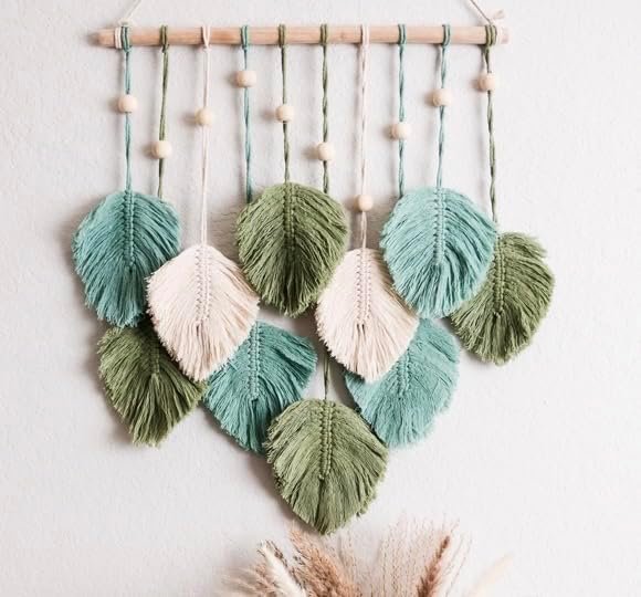
If you don’t already have a leaves macrame hanging for your boho wall, this adorable, three-color one by Snuglife is a great pick up!

This sunset/suncatcher macrame is so unique, combining a lot of textures, colors and concepts. Best of all, it has all the colors we want in our boho space!

This mandala pillow cover is printed on a textured fabric that helps it mimic the look of a hand-knotted rug, for a tiny fraction of the cost!

I absolutely love the look of this 5-Tiered Peach Chandelier. The soft color and fringed texture help add style, as well as light, to your space.

The color and texture of this high-quality plant pot are absolutely perfect for our space.

The muted colors and fluffy texture of this knitted Boho pillow cover help add a soft coziness to your space!
I absolutely adore everything about this bright yellow fleece throw with its pom-pom fringe. In fact, it definitely went into my own personal shopping cart while I researched for this post. I only post things that I would buy myself, and this is one item I just couldn’t resist!
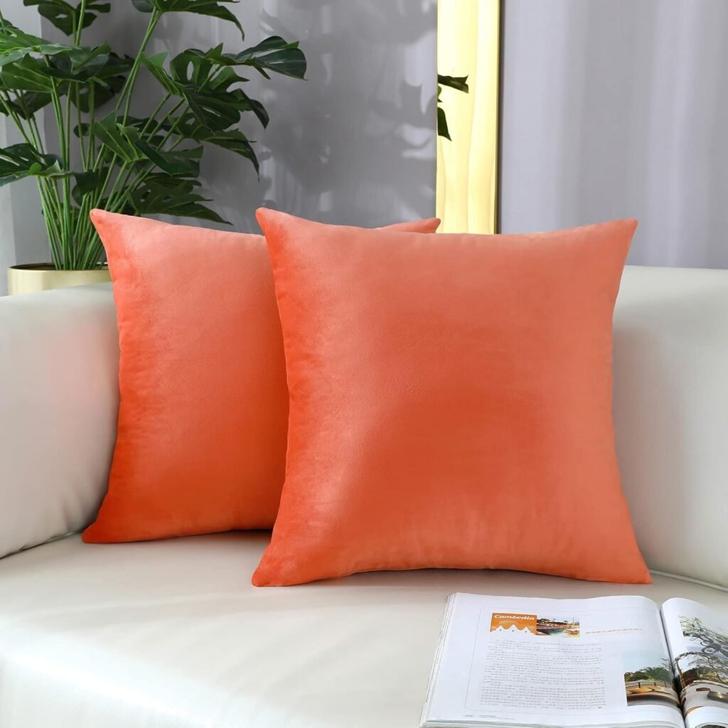
These velvety pillow covers add a splash of peach and texture to your gorgeous bright yellow couch.

This adorable yellow two-seater sofa has classic lines and plush cushions. Its perfect for adding a sunny accent to any living room, big or small.

Wow! Can you imagine how these beautiful mandala stencils would look, either painted over the the center of the drawers or repeated across the entire plane?
Key Takeaways for Your Boho Living Room Design:
- Dominant color: Pick a bold, personal shade (like pink!) that sets the tone for the room.
- Secondary color: Add vibrancy with a complementary shade (yellow, in this case).
- Accent color: Use a small amount of contrast (teal) to keep the design from feeling flat.
- Textures & patterns: Mix in boho patterns like florals and keep it fun!
- Final touch: Incorporate unique furniture pieces, like a yellow sofa or custom stenciled media table, to give personality.
Conclusion
Designing a space is all about balancing colors, textures, and personal style. With this bold boho living room design, I was able to bring together natural, vibrant colors and playful patterns to create a cheerful, inviting environment. By following the 60-30-10 rule and carefully selecting furniture and decor that complemented the color palette, I created a design that felt both fresh and harmonious.
I hope this process inspires you to create your own vibrant, boho-inspired space. Remember, design is all about making a space that reflects you!
If you enjoyed this post and want to explore more ideas related to color in interior design, check out our full Color Scheme directory!


Leave a Reply